User Research & Design Portfolio
Improving User Experience for
Electronic Health Records (EHRs)
Design / Iterations
New User Experience
Problem
The main problem I tried to solve is how to decrease alert fatigue by increasing user and improving the interface. Having multiple alerts causes competition for the user’s attention, leading to ignored alerts and cognitive overload by trying to prioritize endogenous cues.
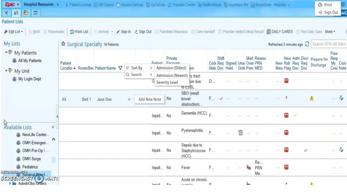
Solution
Solutions were created by hiding options by way of collapsible menus, dropdown menus, and fly-out menus.
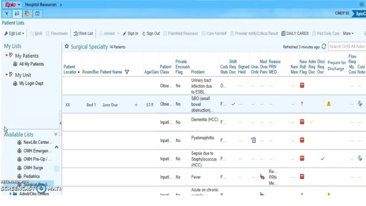
Side-by-side
Before
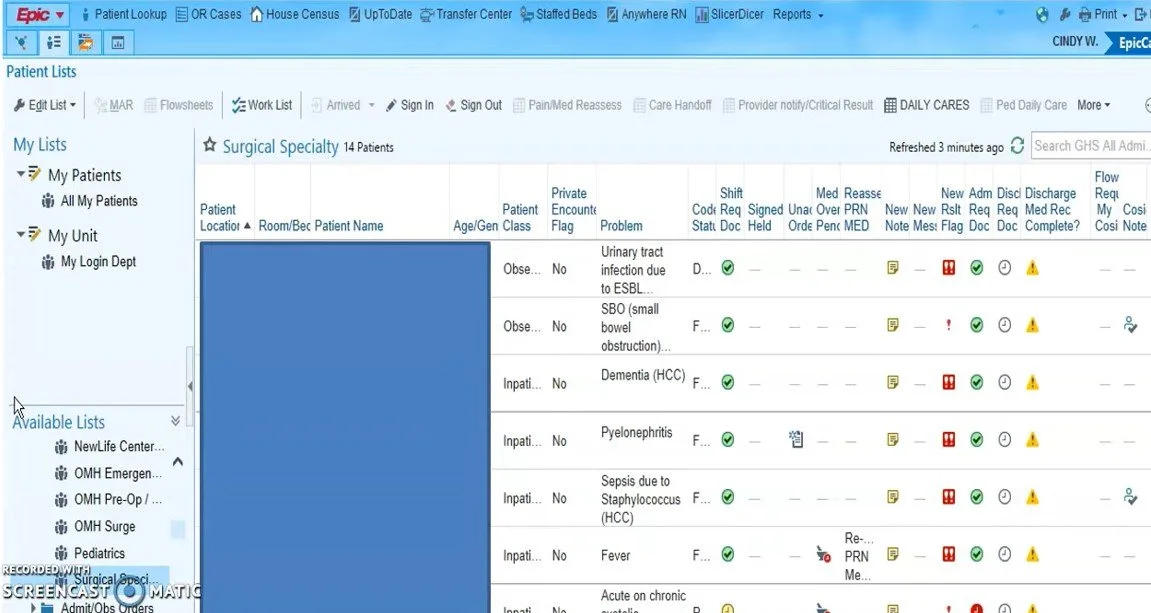
After
UI Redesign
Work in Progress; Last Updated: 4/25/26
Regrouped Navigation Menu: Minimizes choices in the navbar, reduces visual clutter, and working memory cognitive load.
Typeface/Size: Open Sans, Minimum size 16pts
Soft Black: To reduce eye strain: #121212
Light Blue Background: To reduce eyestrain
Changed Surgical Specialty information to horizontal scroll: Allows for complete copy information and larger letter spacing (kerning) to improve legibility.
Color Palette: Checked for Accessibility
Workflow
Each section is within its own frame and utilizes main components and styles to optimize iterations.
Autolayout has been used for the main components to maximize responsiveness.
Desktop: Closed Navigation Drop-Down Menus
Desktop: Opened Navigation Drop-Down Menus